What is the history of the original iCurve?
I had just started as Director of Marketing at Griffin Technology and was using the original lucite Apple Cinema Display and Titanium PowerBook in a dual screen setup. I had balanced my TiBook up on an empty iPod box to add a bit of height, but thought that this makeshift solution was quite ridiculous – so I invented a better one. It was the first product I ever designed, and the first stand specifically made for Mac notebooks! Sketching that idea on a napkin, then seeing it delivered to a market of appreciative Mac users changed my life forever. Fun fact: my wife came up with the name, iCurve.

First Handmade Prototype – Fall 2002

Andrew Green with the first iCurve shipment – May 23, 2003
Drawing inspiration from your very first design, what made you want to bring Curve back?
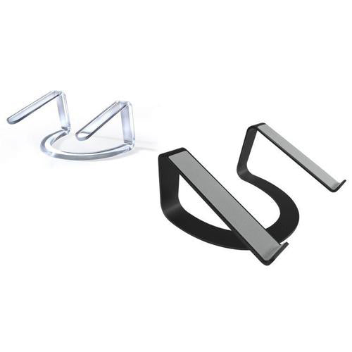
I always loved the original iCurve for its beautiful lines and simplicity. Although simple in design, its elevations and angles were meticulously thought through for months. Incredibly, the ergonomic dimensions set in the first version have remained almost perfect (and have been copied by many other MacBook stands) over the years.

I knew someday I wanted to refresh the classic design for the modern Mac universe. In thinking about bringing it back to market, I visualized Curve as a thin metal ribbon – kind of like a Möbius strip. Utilizing aluminum with a matte black finish, Curve is a fresh remix of the original classic that looks simply stunning, especially when supporting the new Space Grey MacBooks.

Now that you have it back, how do you use your Curve and why?
I use my Curve as part of a dual-screen setup. A 13-inch MacBook Pro with Touch Bar is elevated directly beside my LG 5k screen. The space underneath is much appreciated, adding a bit more desk real estate. I often put my keyboard underneath to create more space to sketch or test prototypes. The best part is that when I take my MacBook off the stand, Curve still looks cool. It’s a desktop sculpture rather than a fractured setup with an empty hole. I firmly believe that when the tools you use are beautiful, they elevate the work you create with them. I think the new Curve fits that description perfectly.

Whether you want a throw back to your favorite stand of the early aughts, or if you just want to update your setup to better reflect that innovative design of the new MacBooks, Curve is available at twelvesouth.com today.


